
Overview The #PhotoMappers project is in its 11th year of providing situational awareness to federal,…
![]() Eadie Kaltenbacher, GISP, began volunteering with Oregon Environmental Council (OEC) in February 2018,as a way to combine what she was learning in her MBA program with her background in GIS.She initiated OEC’s partnership with Esri via an ArcGIS Online license for non-profits. The AGO license was used for the first two projects, and then Eadie signed up for the GIS Service Pledge and gained access to ArcGIS Desktop for the remaining projects. The following sections detail OEC’s accomplishments with AGO and ArcGIS Desktop.
Eadie Kaltenbacher, GISP, began volunteering with Oregon Environmental Council (OEC) in February 2018,as a way to combine what she was learning in her MBA program with her background in GIS.She initiated OEC’s partnership with Esri via an ArcGIS Online license for non-profits. The AGO license was used for the first two projects, and then Eadie signed up for the GIS Service Pledge and gained access to ArcGIS Desktop for the remaining projects. The following sections detail OEC’s accomplishments with AGO and ArcGIS Desktop.
World Water Day 2018
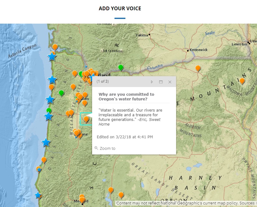
World Water Day took place on March 22, 2018, and Water Communications & Outreach Director, Stacey Malstrom, led OEC’s campaign to enable the community to show their commitment to Oregon’s water resources. One important piece of this campaign was an interactive map where people could “add their voice” through crowdsourcing technology to share why water is important to them.
ArcGIS Online was also used to generate data layers in the map for World Water Day events around the state and quotes from community leaders, including industry, tribal, and recreation professionals.
Diesel Sampling Project
Oregon Environmental Council’s Toxic-Free Environments Program ran a sampling program to measure diesel particulate matter in vulnerable locations. Samples were collected and results tabulated into a report for use in program development. But where should the team focus its efforts?
Volunteer Eadie Kaltenbacher partnered with OEC Healthy Communities Engagement Manager, Rapahela Hsu-Flanders, to generate a series of maps to help with the site selection process. Criteria such as income levels was used to identify vulnerable populations, and demographic data and diesel monitoring data from EJScreen was combined to create customized maps. These maps enabled us to visualize where the demographic and pollutant areas overlapped. Furthermore, new primary data collected at preschools, senior centers, and other sites where vulnerable populations congregate were added to additional layers on the maps. The result was a clear picture of high priority areas for sampling sites.
Bike Project
For Bike-to-Work month in May 2018, Oregon Environmental Council invited staff to participate in a community-wide biking challenge. Participants logged their biking mileage into an app and could see their results as numeric totals. However, there was no mapping functionality.
With the support of Raphaela, OEC’s Healthy Communities Engagement Manager, Eadie sat down with each staff participant and mapped their daily bike commute route on a web map. This allowed us to visualize bike routes in terms of distance. But we wanted to go a step further – how did these routes compare to each other in terms of elevation?
ArcGIS Desktop had the functionality we needed to create elevation profiles. Eadie created personalized elevation profiles for each route, customizing and scaling them so distance and elevation could be compared appropriately. Now we could see who had the longest route, but also who biked the most hills. The participants, through this friendly competition, were inspired to continue their biking.
Home Energy Scores
At the start of 2018, the City of Portland introduced a new requirement for realtors to provide a home energy assessment on homes for sale. This report lists a variety of factors, including how much energy a home is likely to use, the home’s carbon footprint, and a total score out of ten. The idea is that prospective buyers will be able to better understand the energy costs associated with homes, as well as any potential improvements they could make to increase energy efficiency.
OEC wanted to know if there were any patterns that we could deduce from these reports: for example, are there demographic patterns related to home energy scores? Are home prices related to energy scores? Are there geographic clusters where there are similar improvements that can be made? GIS can be used to visualize these themes and overlay them to identify patterns.
The first step was to distinguish areas of high ownership from high renter proportion, because owners are the targets of OEC’s programs. Owners have both incentives and the ability to make major changes to their homes. To begin this project, Eadie used ArcGIS Desktop to collect census data at the block group level. Next, Eadie added tabular housing tenure data from American Community Survey, which breaks down housing by whether it is owned or rented. ArcGIS Desktop was essential to extract the data, join it, and symbolize it. The result was a map showing the proportion of owned and rented homes. This map was the starting point for discussions with potential business partners to evaluate incentives for energy efficiency improvements.
Algae Bloom Story Map
The summer of 2018 was a disturbing time for residents of Salem, Oregon, as they lived through several weeks fearing the safety of their drinking water. There were advisories in effect because of toxic levels of cyanobacteria in the water, due to algae blooms. Eadie worked with the Water Communications & Outreach Director, Stacey Malstrom, and intern Sydney Krisanda, to design and create an interactive story map to document the history and current status of algae blooms on Oregon’s waterbodies, including lakes, rivers, reservoirs, and more. The blooms affect drinking water quality as well as livestock, pets, recreation, and agriculture.
To create this story map, data was collected on the locations of the algal outbreaks, as well as whether the event was classified as an “Advisory” or “Concern.” Sydney developed a time-enabled graphic to illustrate the increase in algae blooms over time, with outbreaks grouped by county.
This story map powerfully illustrated how algae blooms impacted the entire state of Oregon, while also specifying examples that people could investigate in more detail. The story map loads with just eight points, so it seems manageable, but as the user scrolls down they have the option to view all “algae concerns,” which shows more than a hundred points in the state and emphasizes the scale of the problem.
The story map combined vivid images, graphics, videos, and compelling text with location data for a powerful message.
Related Missions


